Color can make a difference to mood, accentuate architectural elements, and help unify a house. Instead of designing a color scheme for every room, many interior designers recommend that you create a cohesive color palette that will bring all the rooms together, but each area will have its own individual flair. Coordinated solutions create a more spacious, tidy, and welcoming atmosphere within homes, which is particularly significant in today’s competitive rental market. Experts in the field of San Diego property management can easily conclude that the well-thought-out use of colors can help to make the interior of a property look more impressive, attract more potential customers, and enhance the value of the rent. When using a neutral color palette with accent colors, one can ensure that the interior’s design is classy, functional, and versatile, standing the test of time for many years.
5 Room-by-Room Color Tips for a Cohesive Home
- Start with a Neutral Foundation in Shared Living Spaces
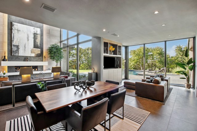
When renting a property, professionals involved in San Jose Property Management often recommend using warm neutral colors like soft beige, light taupe, warm white, or subtle gray in living spaces, as they are considered timeless and good for a wide variety of tenants and their values.
Living rooms are frequently the focal point of the home and can be the perfect place to set up the main color scheme. Neutral walls can be used to decorate with art, furniture, and other accessories and can contribute to a bright, welcoming atmosphere.
Use of textures like rugs, cushions, curtains, and natural materials brings warmth and enhances the overall color scheme. This way, you’ll have a beautiful base that seamlessly blends into nearby rooms.
Did you know?
San Jose continues to rank among the highest-priced rental markets, with average apartment rents frequently ranging between $2,600 and $3,700 per month.
- Introduce Warm and Inviting Colors in the Dining Area
Colors that promote a sense of comfort, discussion, and relaxation are ideal for dining rooms. The neutral grey-brown, olive, caramel, and clay hues offer a cozy atmosphere and continuity with adjoining living areas.
These warm hues are complemented by natural wood furniture, woven lighting fixtures, and linen textiles, adding a touch of elegance and welcoming ambiance to the overall design. Adding depth to a room doesn’t have to be done by filling the entire surface area; accent walls or artwork can be used to achieve this.
A well-designed dining room helps unify the house while subtly breaking away from the rest.
- Create Calm Bedrooms with Soft, Restful Shades
The color palette used in bedrooms should be calming and comfortable and should encourage relaxation. Lighter shades of blue, sage green, dusty taupes, warm creams, and gentle lavender tones are well-suited, creating relaxing spaces.
A restrained palette will help reduce overstimulation and add to the calmness. Layered bedding, upholstered headboards, textured throws, and natural wood furniture add layers to these shades, while also providing extra warmth.
Bedrooms are connected to the overall color scheme of the home, but still provide a private and peaceful space.
Did you know?
San Diego remains one of California’s most competitive rental markets, with average apartment rents ranging from $2,400 to $3,300 per month.
- Refresh Kitchens and Bathrooms with Bright Neutrals
Lighter colors will make kitchens and bathrooms look larger and cleaner. White, soft gray, pale greige, and warm ivory are the new hues that offer fresh, timeless interiors and are excellent at reflecting natural and artificial light.
The finishes and colors of cabinets, countertops, backsplashes, and flooring should be cohesive in order to create visual flow. The black fixtures are matte to create a simple contrast; brushed brass or natural stone can be used to add a subtle contrast without detracting from the simplicity of the room.
These are well-balanced mixes that ensure a stylish interior that stays in fashion and pleasing to the eyes throughout shifts in design and tenant tastes.
- Connect Every Room Through Consistent Accent Colors
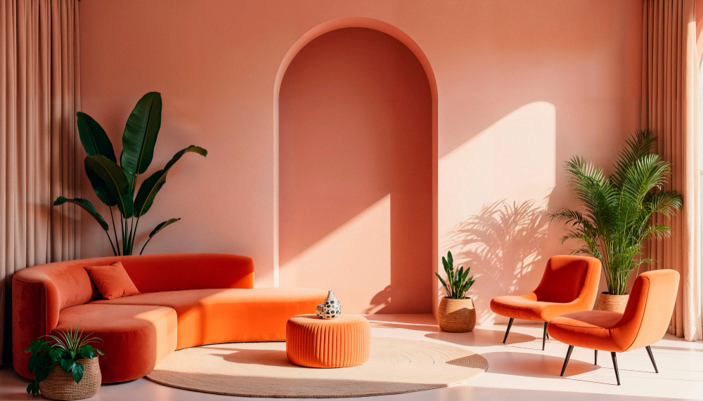
Primary wall colors are not the only factor that makes a home cohesive; accent colors that are repeated throughout various rooms also play a part. Decorative pillows, artwork, ceramics, indoor plants, and textiles offer opportunities to incorporate recurring colors throughout the home.
Repeating earthy greens, warm browns, muted blues, or natural wood finishes adds subtle links between the rooms without making the interiors repetitive. The continuity promotes visual flow, and each room has its own identity.
Colors that are consistent also make it easier to decorate at a later time, as the colors will be easily adaptable for seasonal changes and trends in decorating styles.
End Point
A well-designed color palette can make a difference to anything and make each room in the house look like a grand hotel. By using neutral foundations, accenting with complementary warm-toned colors, providing restorative bedrooms, rejuvenating functional spaces, and introducing accent colors throughout the interior, homes feel welcoming, elegant, and timeless. Cohesive color design not only makes a difference in daily life but can also boost the property’s appeal and rental value in today’s competitive housing market.
Image: Source: Freepik