Your bedroom should be a personal sanctuary—a space designed specifically for unwinding. While we often focus on mattress quality or room temperature, the design choices you make for your walls directly influence your mood, stress levels, and circadian rhythms.
The shades surrounding you can either help your mind settle or keep it buzzing with activity. For instance, certain blue hues can physically lower blood pressure and slow the heart rate. Whether you’re planning a complete makeover or a quick refresh, this guide will help you navigate colour psychology to create the ultimate sleep retreat.
The Science of Colour and Sleep
The Psychology of the Sleep Environment
Colours aren’t just aesthetic choices; they trigger physiological responses. Every hue sends signals to your brain that either encourage melatonin production or stimulate adrenaline.
Research shows that emotional states significantly dictate sleep quality. Since colour directly influences emotion, your paint choice can either mitigate or exacerbate the stress that affects sleep for nearly 28% of the population.
Calming vs. Stimulating Hues
- Cool Tones: Blue and lavender interact with the nervous system to promote feelings of safety and security. Dark blue, specifically, has been identified by researchers at the University of Sussex as the world’s most relaxing colour.
- Warm Tones: Red and yellow have long wavelengths that stimulate the brain. Red is often associated with “alert” states like excitement or even fear—hardly the headspace required for deep rest.
Wavelengths and the Brain
Your eyes contain specialized ganglion cells that are highly sensitive to blue light. These cells help regulate your circadian rhythm. Interestingly, while blue light from screens keeps us awake, blue pigments on walls tend to be soothing.
In biological studies, green light has been shown to help subjects fall asleep rapidly (within 1 to 3 minutes), whereas violet and bright blue light can delay sleep onset.
The Most Relaxing Colours for Better Sleep
1. Cool Blues for Longevity
Statistics suggest that people with blue bedrooms enjoy the most sleep per night. Pale sky blue, powder blue, or chambray create an airy, weightless atmosphere. For a more modern look, blue-grey combinations offer the benefits of blue with the versatility of a neutral.
2. Soft Greens for Natural Harmony
Green connects the mind to nature, which is instinctively grounding.
- Sage Green: Muted with grey undertones for a sophisticated look.
- Mint Green: Provides a fresh, spa-like energy.
- Pro-Tip: Pair green walls with indoor plants to double the air-purifying and calming effects.
3. Soft Whites and Creams
While stark white can feel clinical, “warm” whites and creams reflect natural light beautifully. These shades are ideal for smaller bedrooms, as they reflect light effectively to create an illusion of space while remaining “cozy” rather than cold.

Pictured: Timberland Wooden Ottoman Bed, Soft off-white bedroom décor.
4. Muted Greys
Grey is the ultimate versatile neutral. To keep it from feeling “flat,” choose greys with brown or taupe undertones (often called “greige”). These warmer versions of grey provide a sense of security and pair easily with any bedding or decor changes.
5. Gentle Earth Tones
Shades like cocoa, taupe, and warm beige create a “grounding” effect. They wrap the room in a sense of sturdiness and comfort. These work exceptionally well when layered with cream or gold accents.
6. Pale Pink
Grey-toned pinks, such as dusty rose or clay, have a surprising ability to lower blood pressure. They provide a sophisticated, comforting glow that feels protective rather than “childish.”
Common Mistakes That Sabotage Sleep
1. High-Contrast Chaos
Using three or more bold, contrasting colours (like a sharp black-and-white geometric pattern) creates visual “noise.” Your brain stays engaged trying to process the high contrast rather than settling into a rest state.
2. Reflective Paint Finishes
Glossy or high-sheen finishes bounce light around the room, creating glare from streetlights or the morning sun.
- Solution: Use flat or matte finishes. They absorb light, maintain the truest version of the colour, and create a much softer visual environment.
3. Ignoring Artificial Light
A paint sample that looks perfect in the shop will look different in your home.
- Warm LEDs (2700K): Emphasize yellow and red undertones.
- Cool LEDs (5000K): Emphasize blues and greys. Always test your paint samples under your actual bedroom bulbs.
Step-by-Step: Selecting Your Perfect Shade
Step 1: Analyse Your Natural Light
Room orientation dictates how a colour behaves:
- North-Facing: Receives cool, bluish light; warm-toned paints help balance this.
- South-Facing: Receives intense, consistent light; can handle darker or cooler tones without feeling “muddy.”
- East-Facing: Brightest in the morning; cooler at night.
- West-Facing: Cool in the morning; very warm and glowing by sunset.
Step 2: The 24-Hour Test
Don’t rely on a tiny swatch. Paint a 2ft x 2ft patch on at least two different walls. Observe it at morning, noon, and evening. If you aren’t ready to paint the wall yet, use large pieces of white poster board so the current wall colour doesn’t “bleed” into your perception of the new sample.
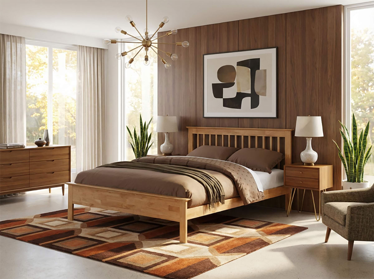
Pictured: Pentre 4FT 6 Double Bed Frame, Mid century modern bedroom décor.
Step 3: Coordinate with Furniture
Your walls should act as a backdrop to your existing investment pieces.
- Dark Wood Furniture: Pairs beautifully with warm neutrals or sage greens.
- Cool/Grey Furniture: Works best with soft blues or “greige.” Ensure your wall temperature (warm vs. cool) matches the temperature of your flooring and large furniture.
Step 4: Apply the 60/30/10 Rule
To keep the room balanced:
- 60% Primary Colour: Your walls.
- 30% Secondary Colour: Your upholstery, curtains, or rug.
- 10% Accent Colour: Your cushions, artwork, or lamps.
Final Thoughts: An Investment in Rest
Choosing a bedroom colour is more than a decorative task—it is an investment in your health. By prioritizing cool blues, soft greens, and matte finishes, you are physically setting the stage for your nervous system to shut down.
Take your time with samples, respect the lighting of your specific room, and remember: your bedroom walls should whisper, not shout. Sweet dreams are much easier to achieve in a room designed for silence.
FAQs
Q: Can I use dark colours in a small bedroom? Yes, but be careful. Dark greys or deep blues can create a “cocoon” effect that feels very cozy. However, ensure you have adequate soft lighting, so the room doesn’t feel cramped or “cave-like.”
Q: Is “stark white” a good choice for sleep? Generally, no. Pure white can feel too bright and clinical, reflecting too much light. Opt for a “off” white or cream with a hint of grey or yellow for a softer look.
Q: Does the ceiling have to be white? Not necessarily. Painting the ceiling the same colour as the walls (especially in lighter shades) can create a seamless, “wrapped” feeling that reduces visual distractions.
Q: What is the single most relaxing colour? Statistically, a soft, muted blue is the most effective colour for lowering the heart rate and promoting long-duration sleep.